Project
- Collaboration, Financing Option
Date
- March 2019 - May 2019
Role
- UX Designer
- Designed all platforms ( Desktop, Mobile Website, App )
- Skills Involved: Brainstorming, Journey Mapping, Content Strategy, Mockups, Wireframing, Prototyping, User Testing ( Online and Lab )
- Tools: Sketch, Adobe Photoshop CC, Usertesting, Invision, Zeplin
BACKGROUND
Assists users to learn about secondary financing options once they got denied from a primary financing plan due to credit reasons. Affirm is a new partner company seeking to provide a secondary finance option, to provide financing to customers who couldn’t obtain funds from a primary bank.
User Scenarios
User attempts to purchase a new Samsung device from the website/shop app. They select a new phone and decide to purchase. During checkout their select the financing option but are denied. After the decline, the user is supplied with a second financing option.
- Any customer who is denied by the primary bank
- If a customer was recently denied by primary bank and return within 30 days
USER FLOW IDEATION
We were required to integrate Affirm’s exist design with our checkout flow due to business reasons so we decided to create a new checkout design. This design referred to the new service with Affirm and also blended Affirm’s design with our branding. Modifying Affirm’s flow is not allowed, therefore we were required to develop a new way to ensure that the overall flow was consistent with Samsung’s branding.
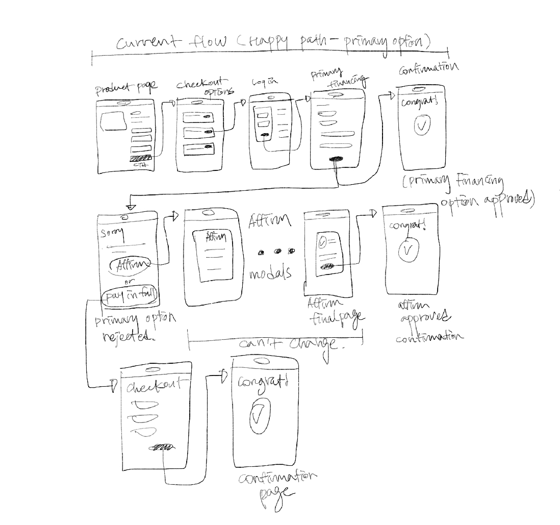
After research, we came up with this simple user flow
LANDING PAGE
After defining the idea, I designed 3 different landing page options
DESIGN HIGHLIGHT
- Tried to convey all necessary information but still use Samsung brand guidelines to make it cohesive with Affirm’s identity
- Adding clear information and emphasizing it will help users to understand the page.


